Quarrie - (In Progress)

Positioning
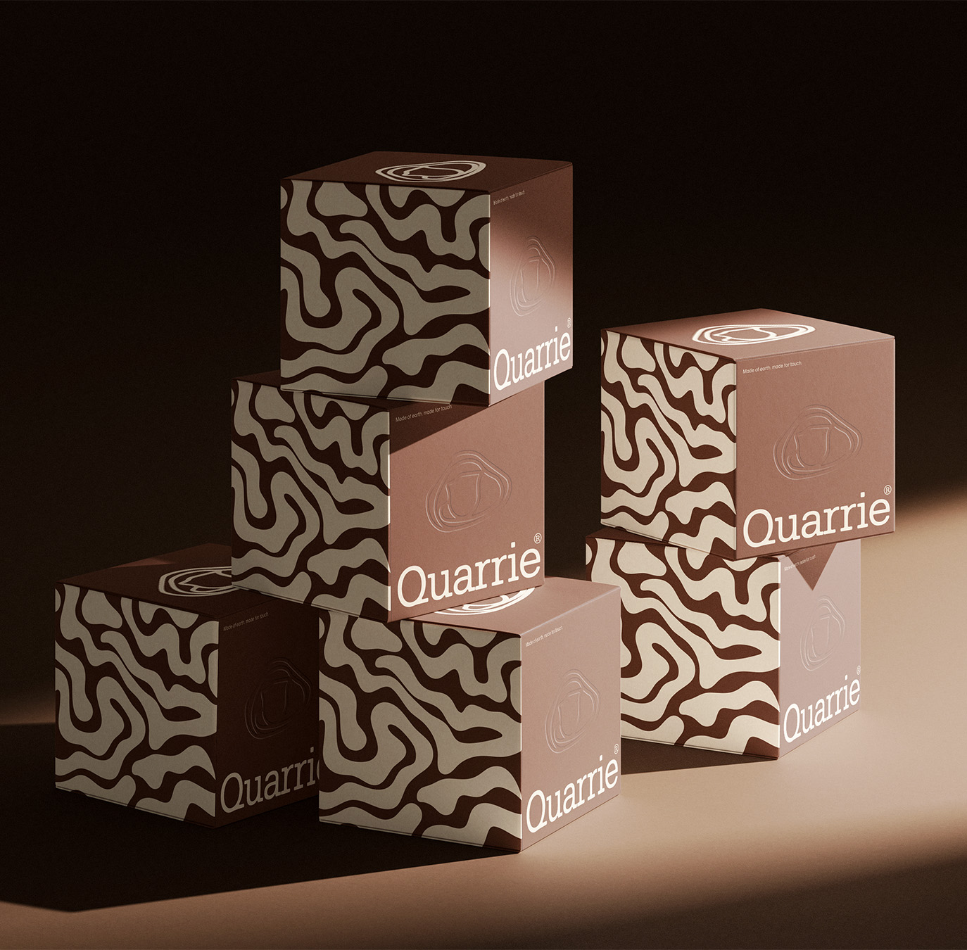
Rejects the "glass skin" aesthetic dominating skincare marketing. Where most mineral or clay brands default to either clinical spa-white or rustic crunchy-granola cues, Quarrie sits between: warm, tactile, grounded, but still refined enough to read as premium.
Color palette
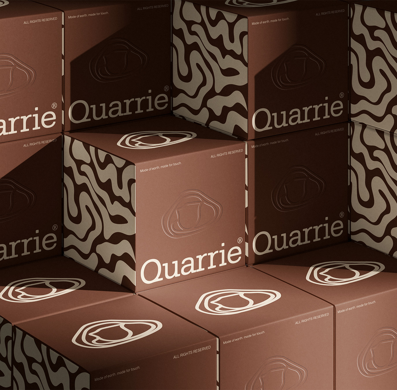
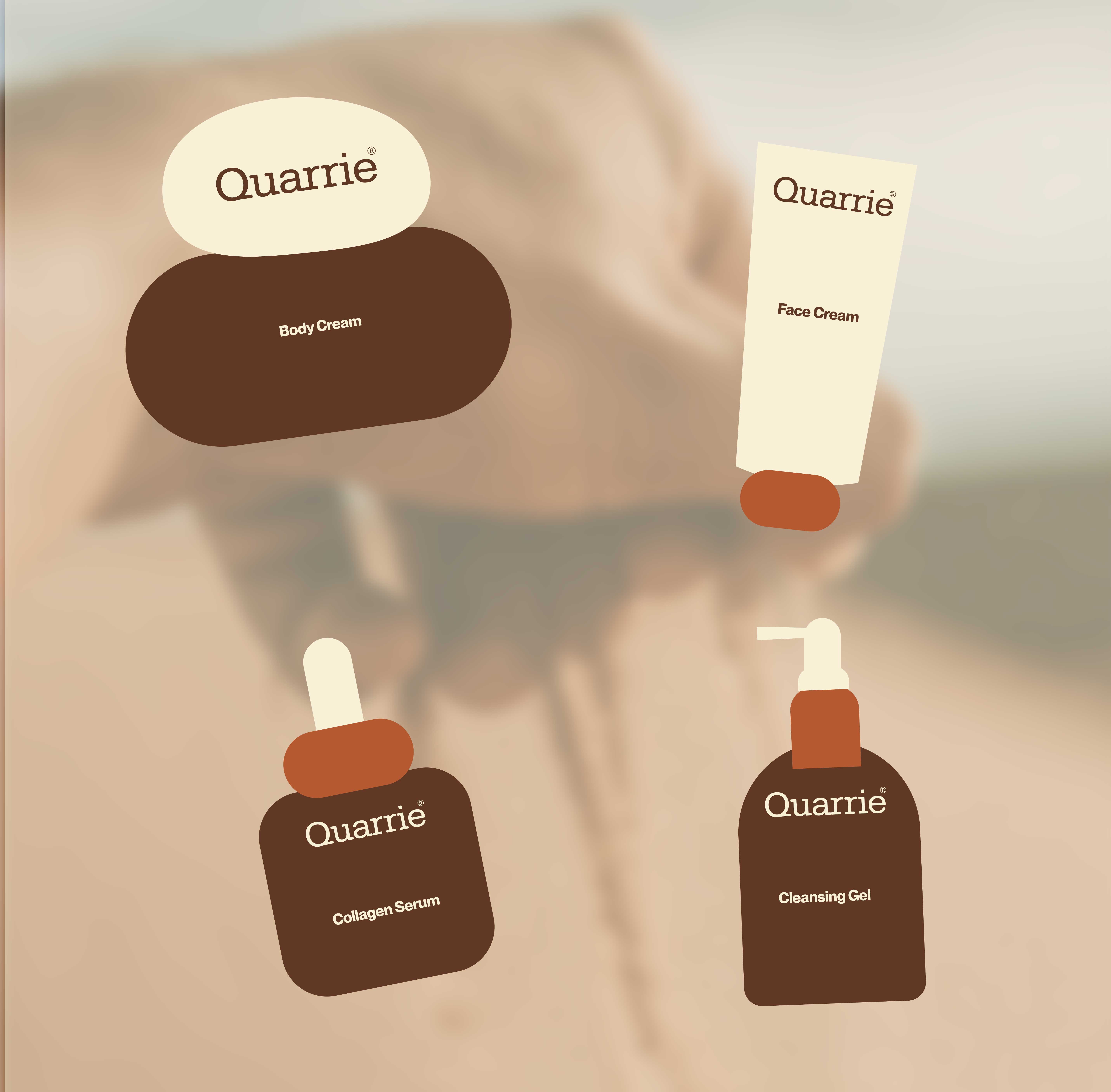
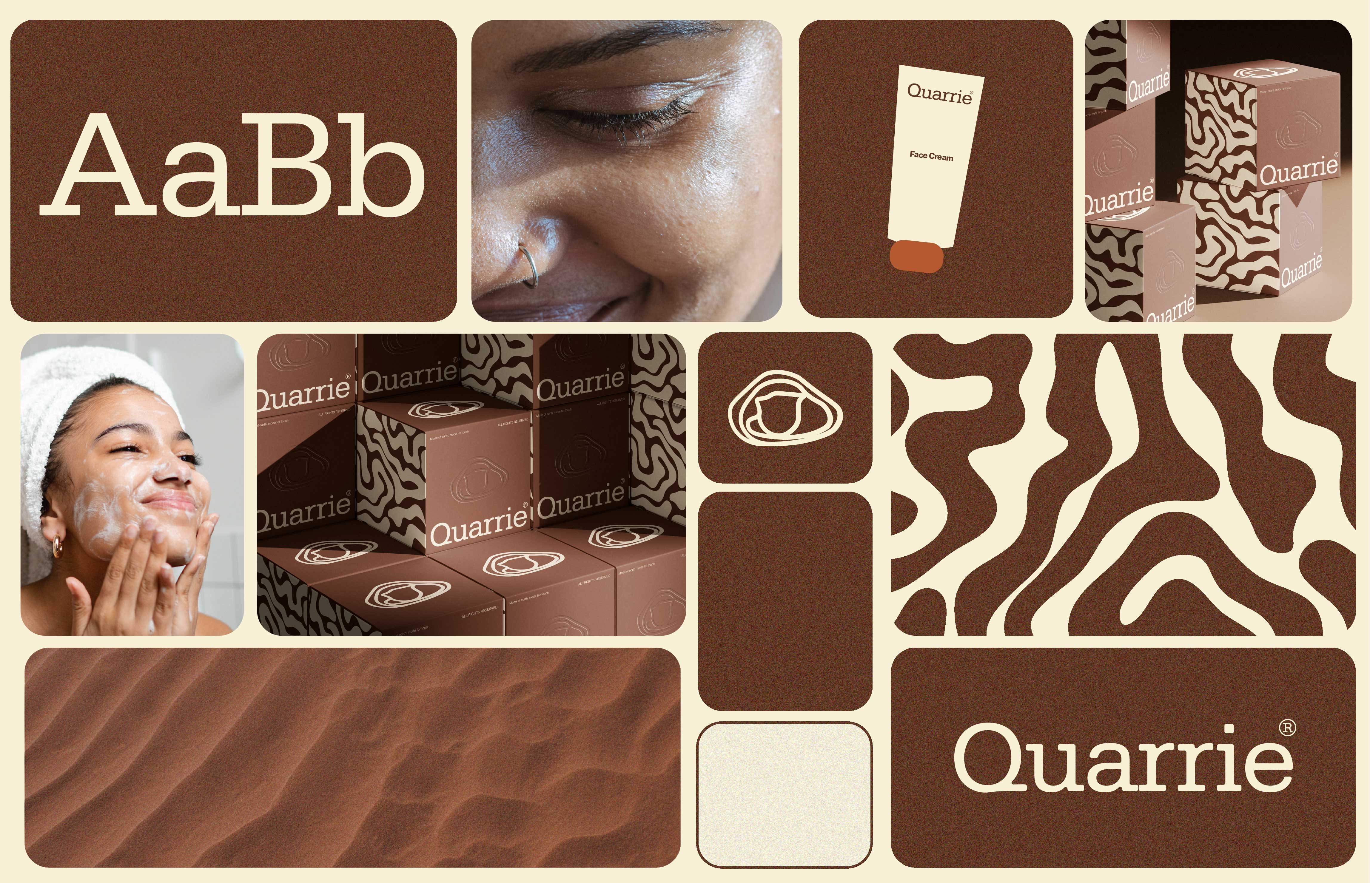
Coffee brown and off-white. Brown carries the earth and stone reference, off-white keeps it from tipping into overly rustic or heavy. Use brown as the dominant tone (packaging, backgrounds, wordmark) and off-white for contrast and breathing room, not the reverse, so the palette reads grounded rather than sterile.
Typography
A humanist serif with slightly irregular letterforms for the wordmark, to carry the "texture and memory" idea into the type itself. Paired with a plain grotesk for body copy and UI so the system stays legible and doesn't drift into decorative.
Photography and texture direction
Macro shots of stone grain, cracked clay, water spreading into mineral surfaces. No dewy highlight or skin-on-glass shots, that's the exact cliché the brand is positioned against. Texture should always read as matte and touchable, never glossy.


.svg)