
I'd love to hear from you
Whether you have a project in mind, or just want to say hi.
Whether you have a project in mind, or just want to say hi.
Shoot me an email

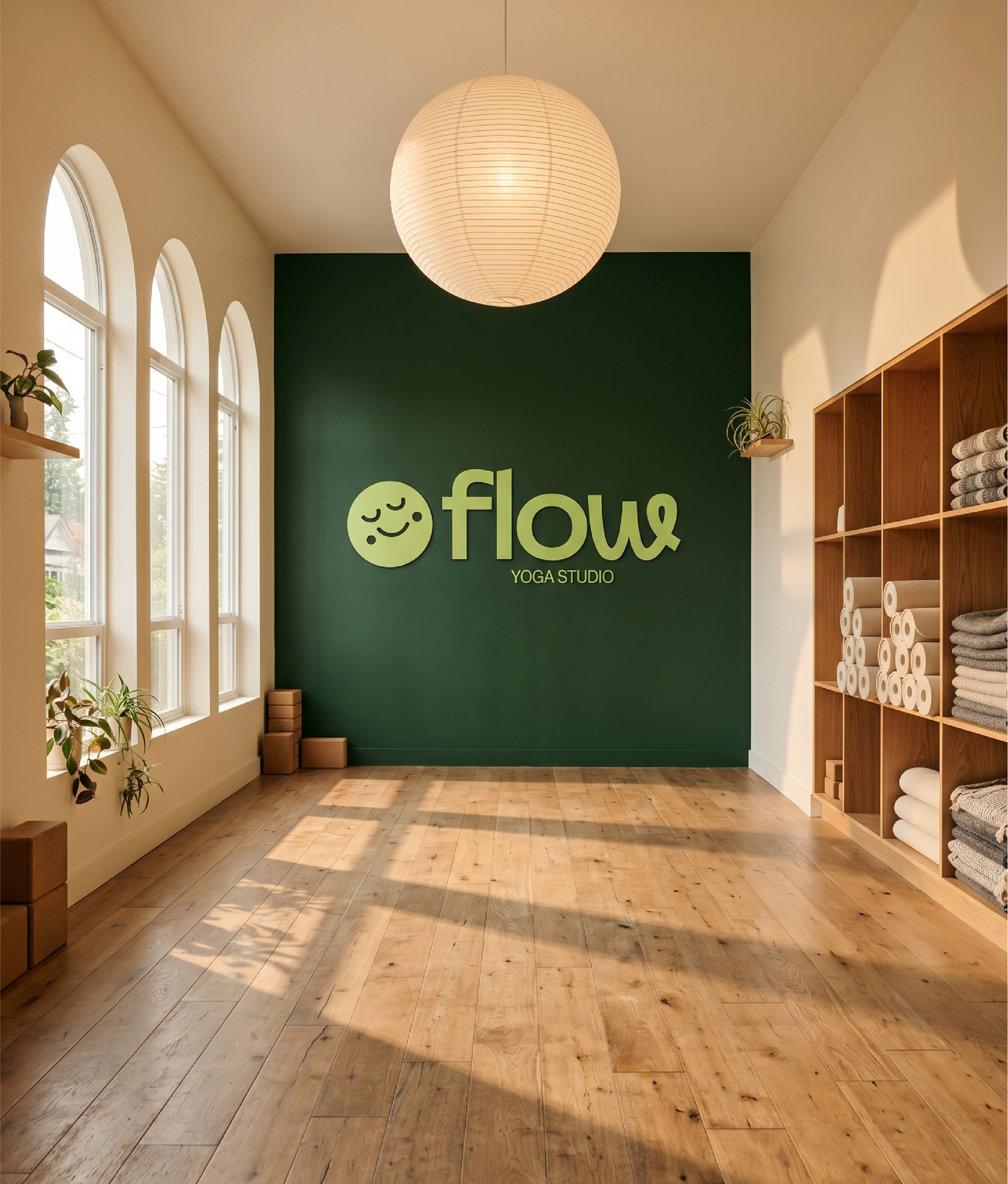
This concept project imagines Flow opening a permanent studio in 2025. The challenge: build an identity that can hold an $89/month membership and a physical space, without losing the reason strangers showed up to a park in the first place


Wellness branding takes itself very seriously. It has to, because most of it is selling you a better version of yourself, and that pitch only lands if everyone keeps a straight face. Soft voices, sacred spaces, transformation, alignment, intention. Look at it for too long and the whole category starts to feel like a yoga class you're not allowed to laugh in.
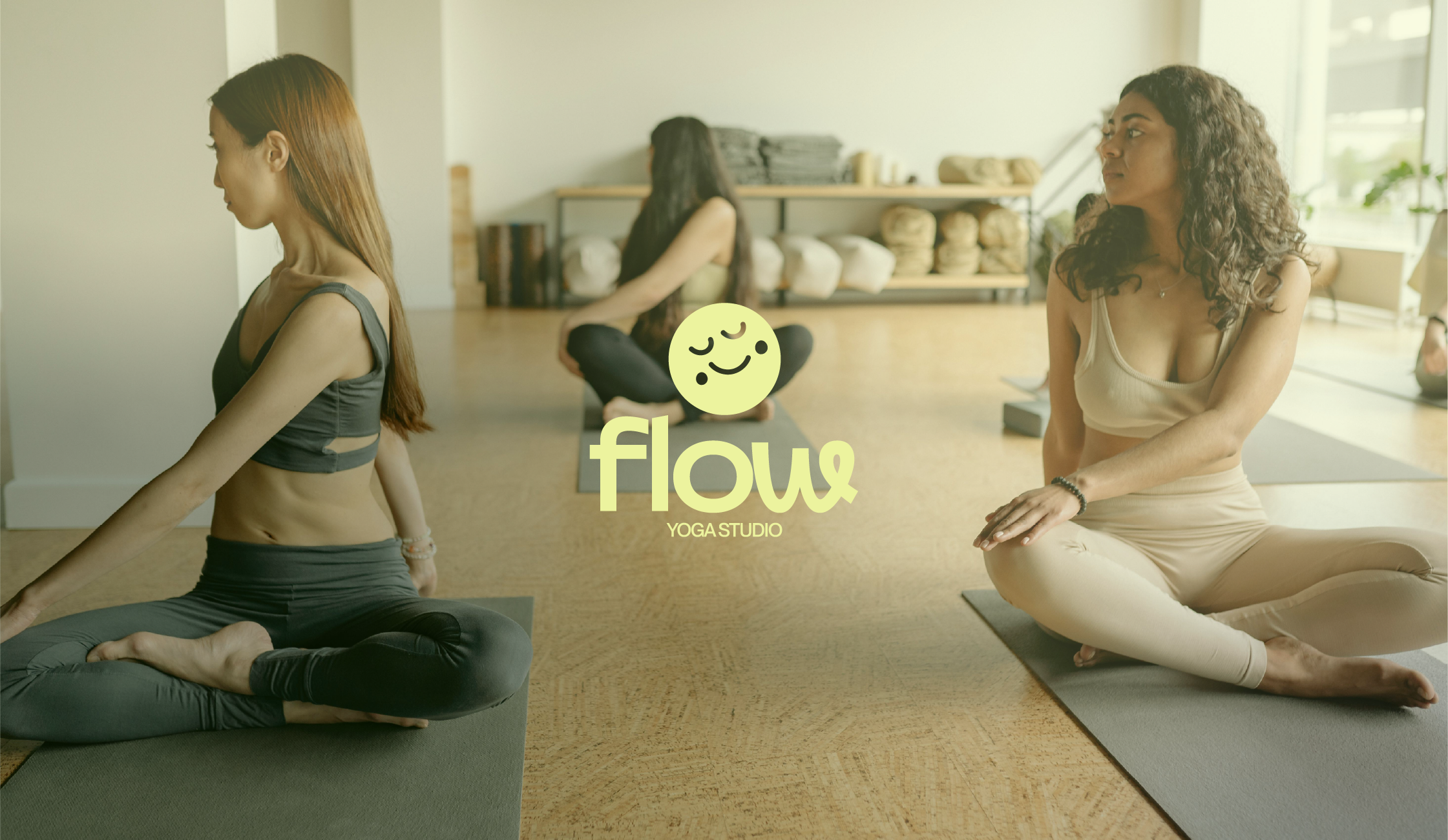
Flow's audience didn't want that. They were people who showed up to a public park because it was free, close, and nobody was watching. They could already tell the difference between a studio that wanted them and one that wanted to perform at them.
So the question I kept coming back to was this: what does a wellness brand look like when it stops performing wellness and just acts like a place you'd actually want to spend time in?
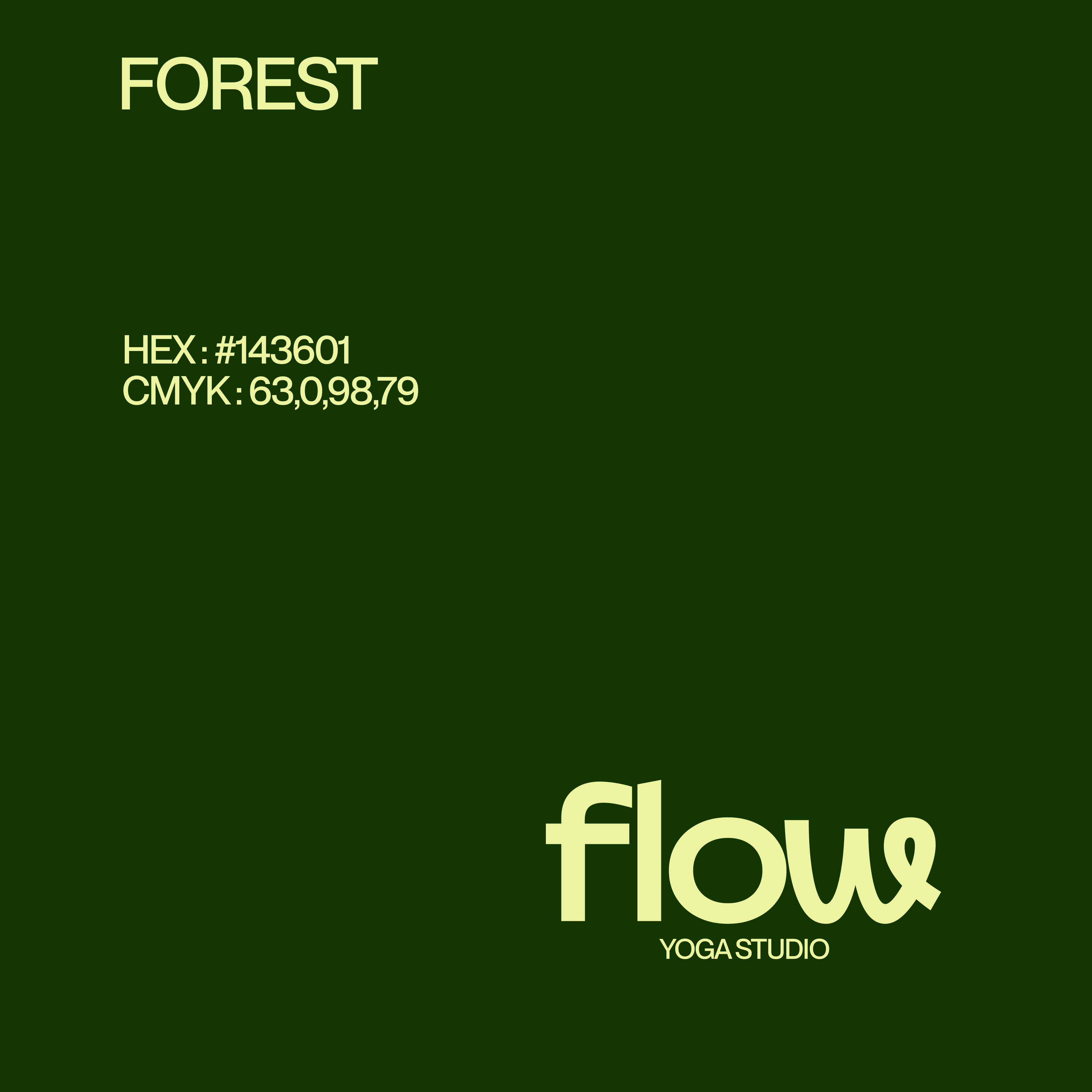
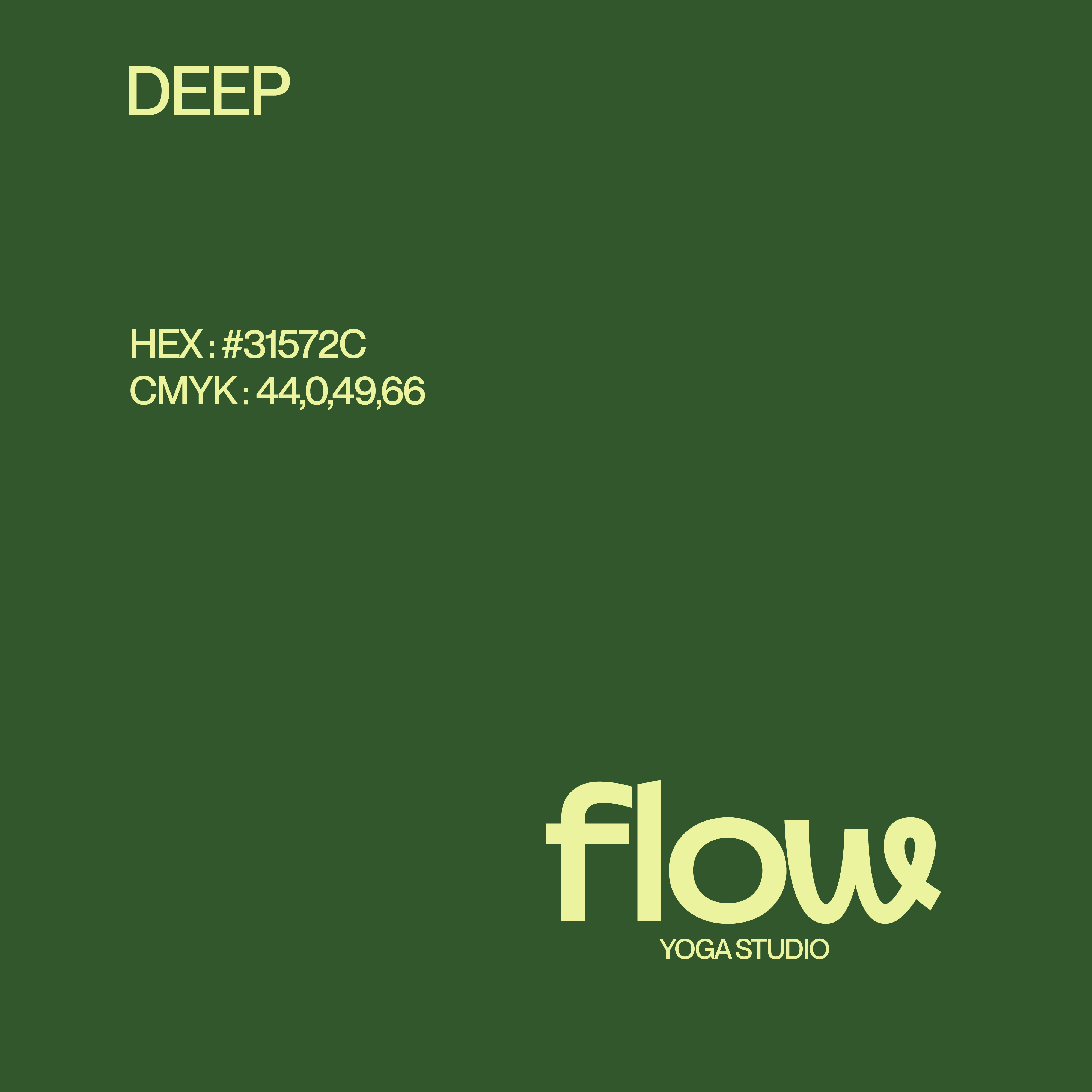

A palette that doesn't apologise.Most yoga branding plays it safe with muted tones. Flow goes the other way. Deep forest greens lead, lime co-stars, and the whole palette refuses to fade into the wellness wallpaper. It looks like East Vancouver in early summer, not like a spa anywhere.
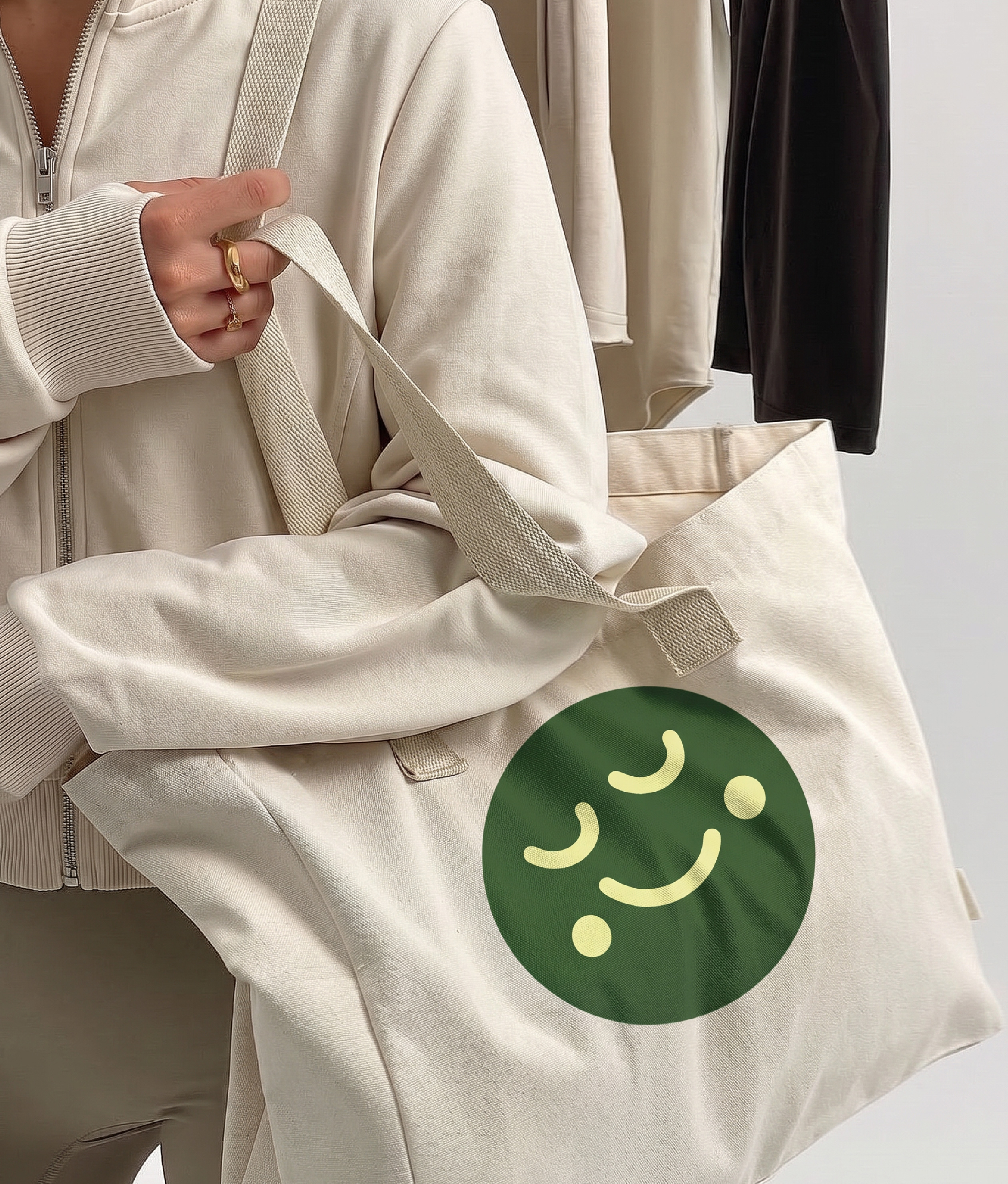
Characters as the whole personality.The system isn't a logo with characters added on. The characters are the system. Calm, Love, Curious, and Wonder each lead a class type and carry the brand's emotional range. A logo can tell you what something is. These four can tell you how it feels.
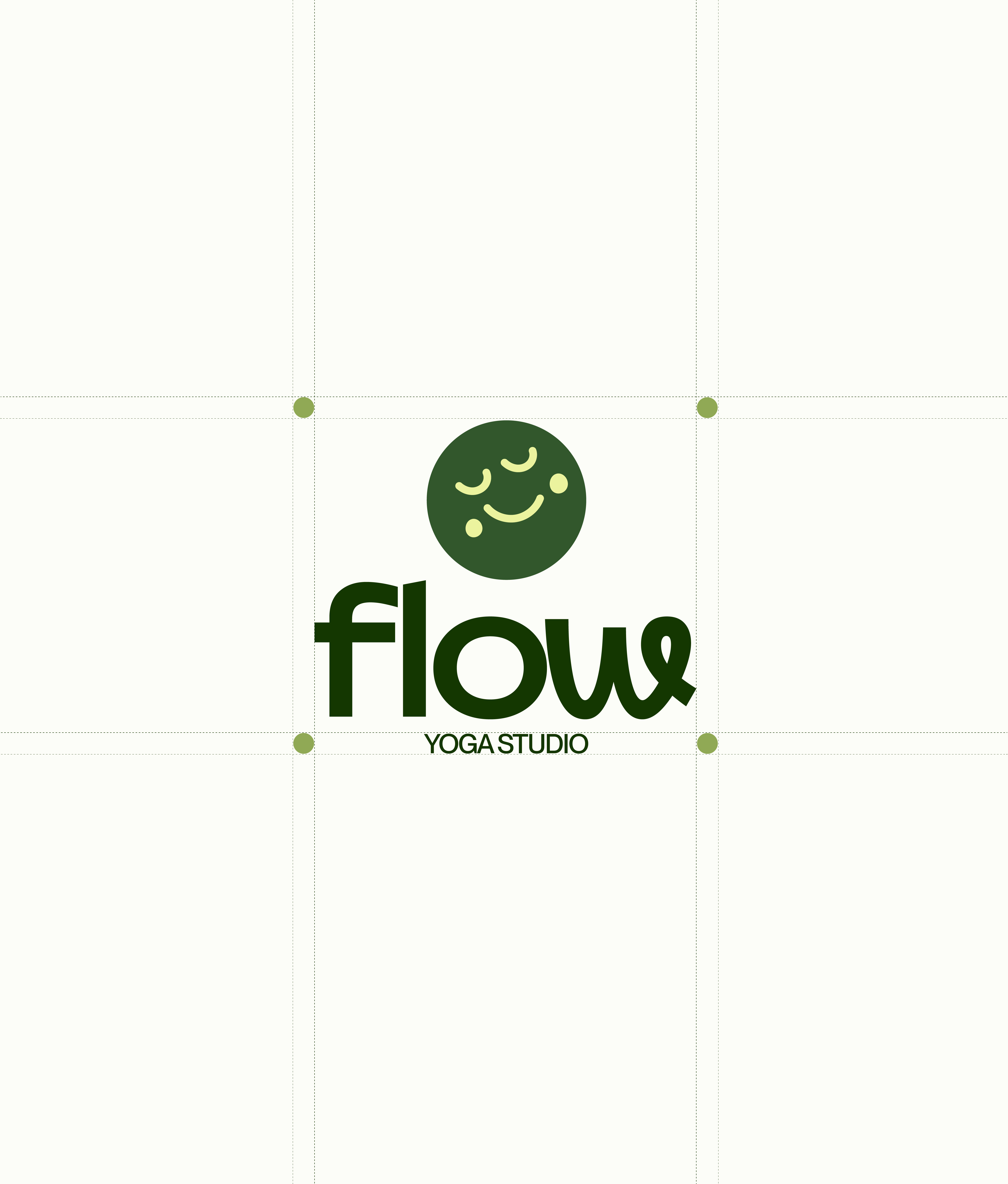
A wordmark that smiles.Transforma carries the personality of the whole brand in one word. The lowercase weight, the rounded forms, the playful "W" at the end every part of the wordmark is doing emotional work. PP Montréal supports it underneath for body and UI, quietly, so the wordmark doesn't have to share the spotlight.
The lime offset treatment turns the characters into objects people actually keep. Stickers on laptops and water bottles do more for the brand than any ad could.