
I'd love to hear from you
Whether you have a project in mind, or just want to say hi.
Whether you have a project in mind, or just want to say hi.
Shoot me an email


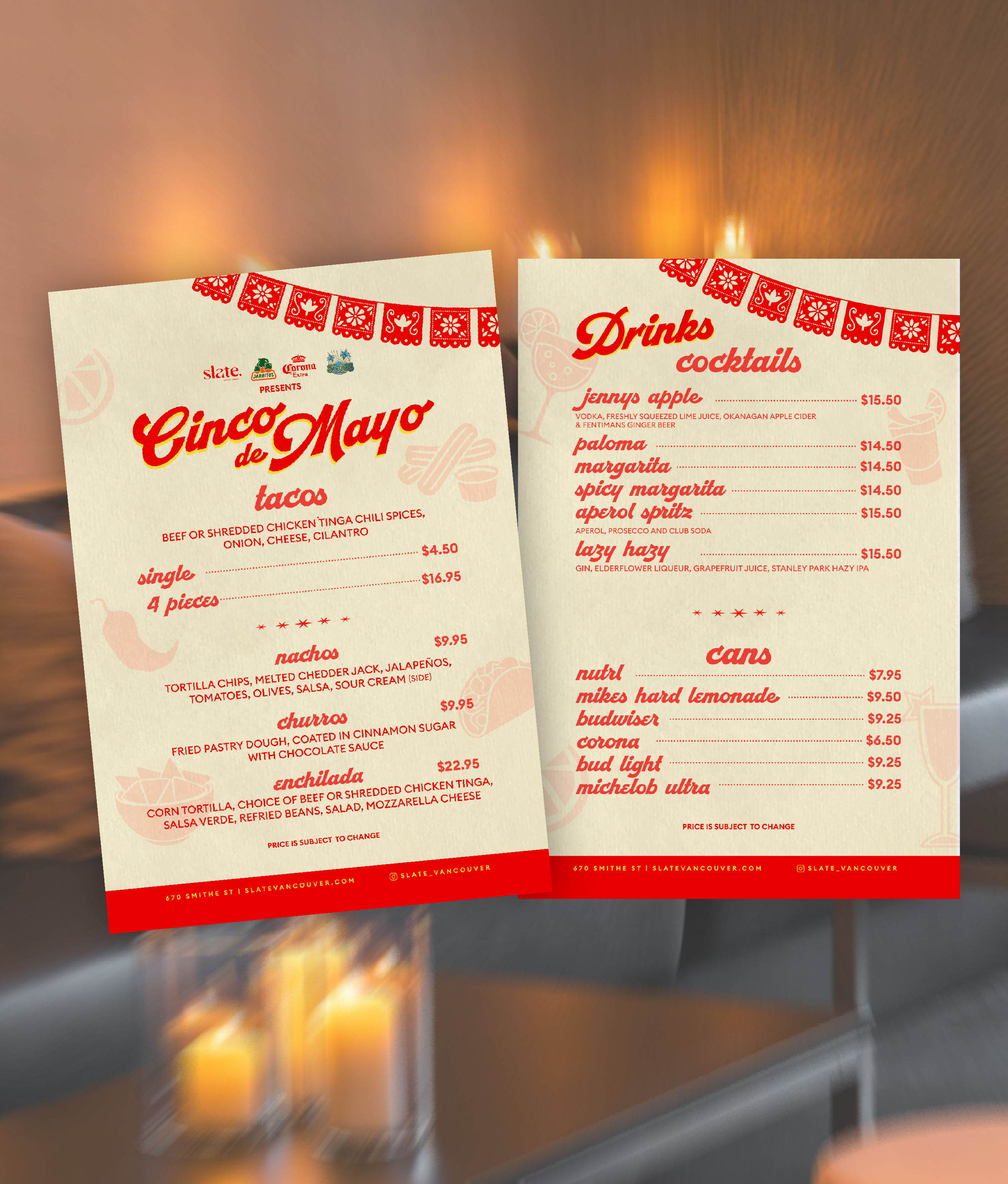
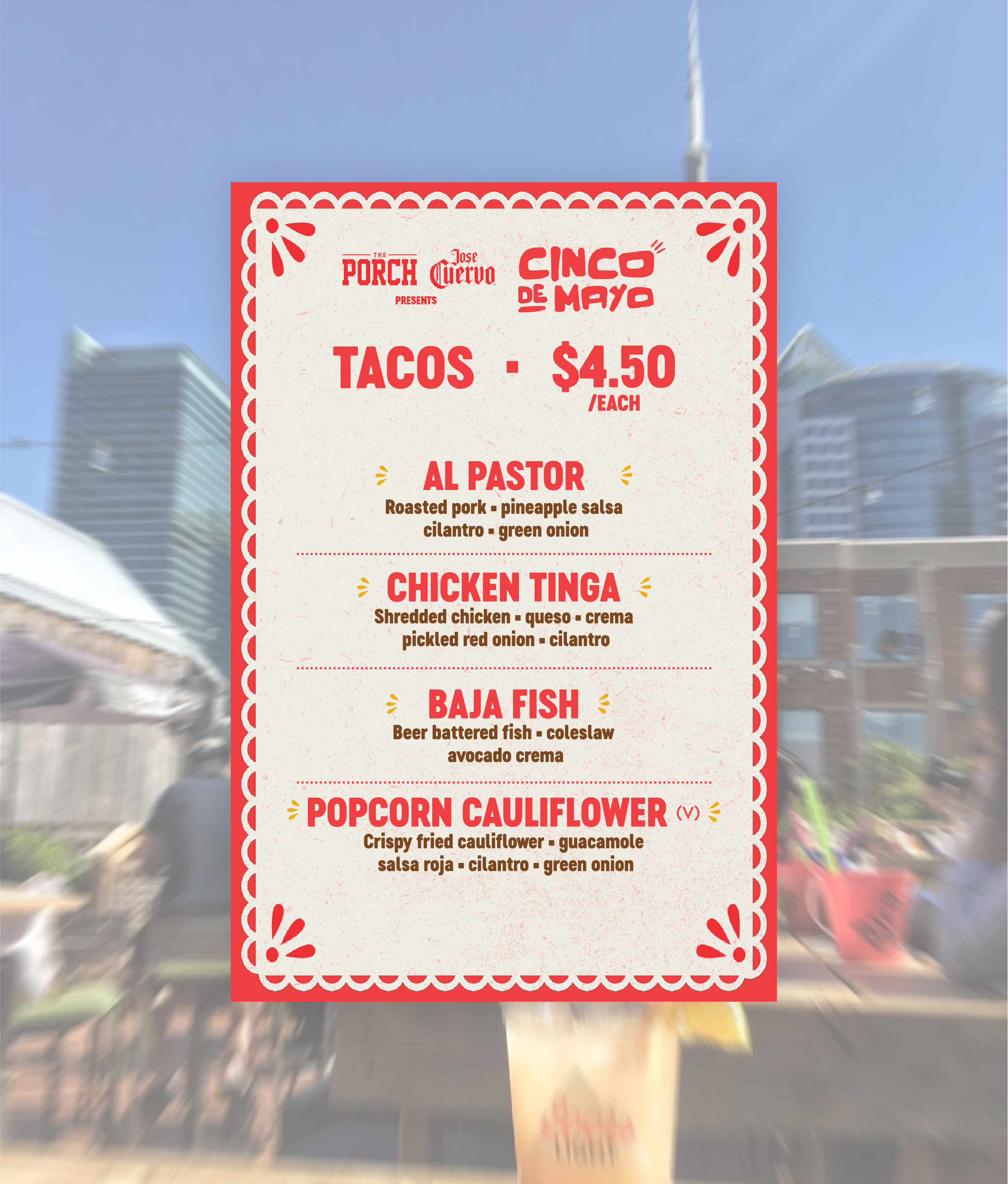
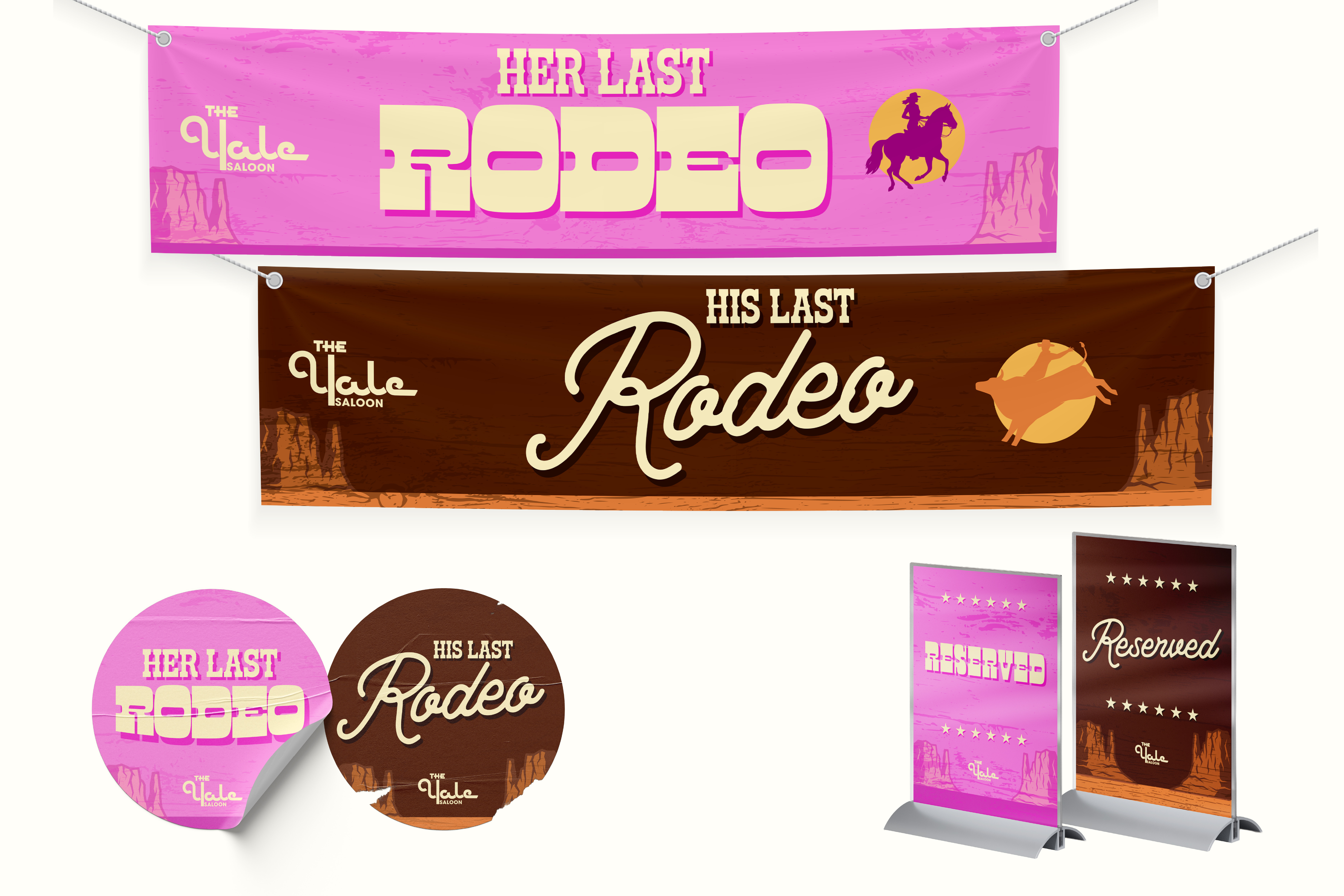
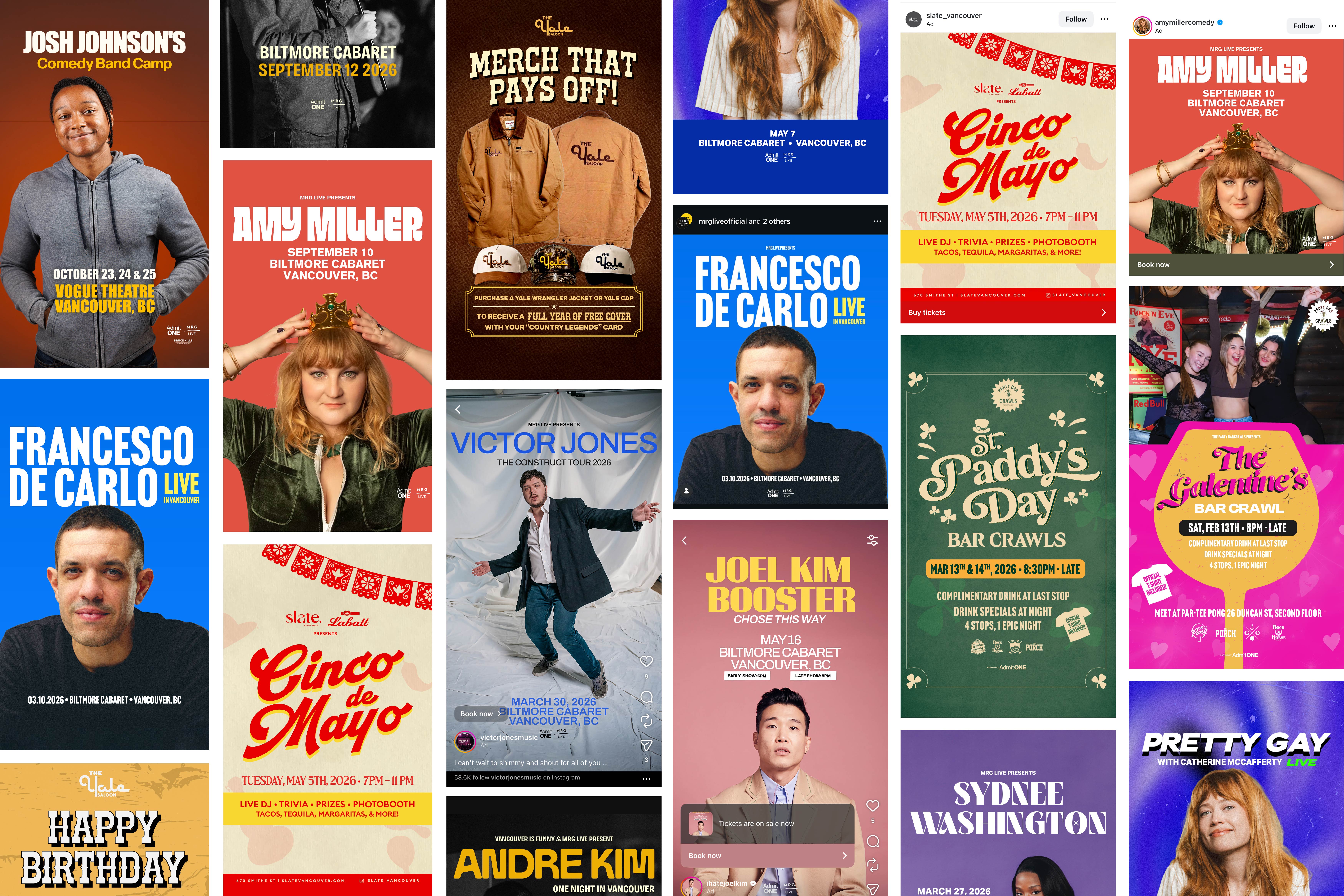
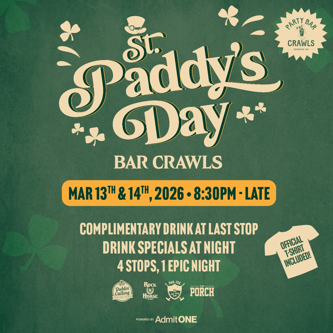
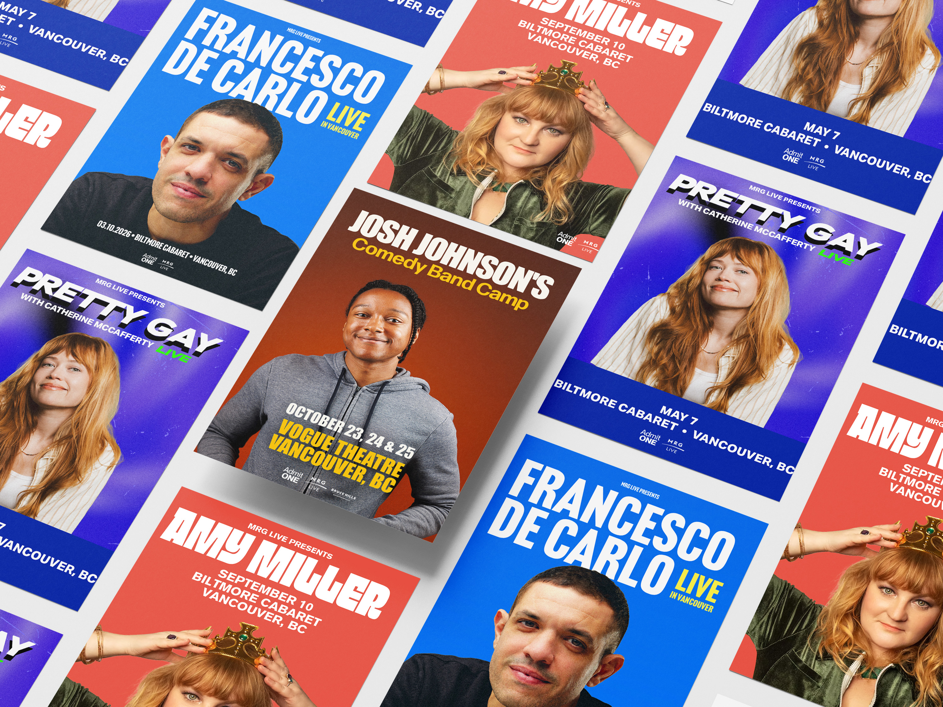
MRG Group operates some of Canada's most prominent live music venues and hospitality spaces. These posters were produced for real use printed, posted, and live.

.jpg)
.jpg)
Design Process
.jpg)

The Constraint That Made the Work Better
Having to operate within established brand guides is one of the most useful constraints in commercial design. It removes decoration as an option and forces every decision to be justified against the system. Some of the strongest pieces in this set are the ones where the brand guide was most restrictive.
Takeaways
Multi-format design is a compositional discipline, not a resizing task. Each format requires its own hierarchy decisions. Working within someone else's brand guide is a professional skill. Knowing how to extend a system without breaking it is what separates intermediate designers from juniors. Readability at distance (coroplast, ROAR boards) and readability at thumb-scroll speed (Instagram) require different approaches.