

I'd love to hear from you
Whether you have a project in mind, or just want to say hi.
Whether you have a project in mind, or just want to say hi.
Shoot me an email

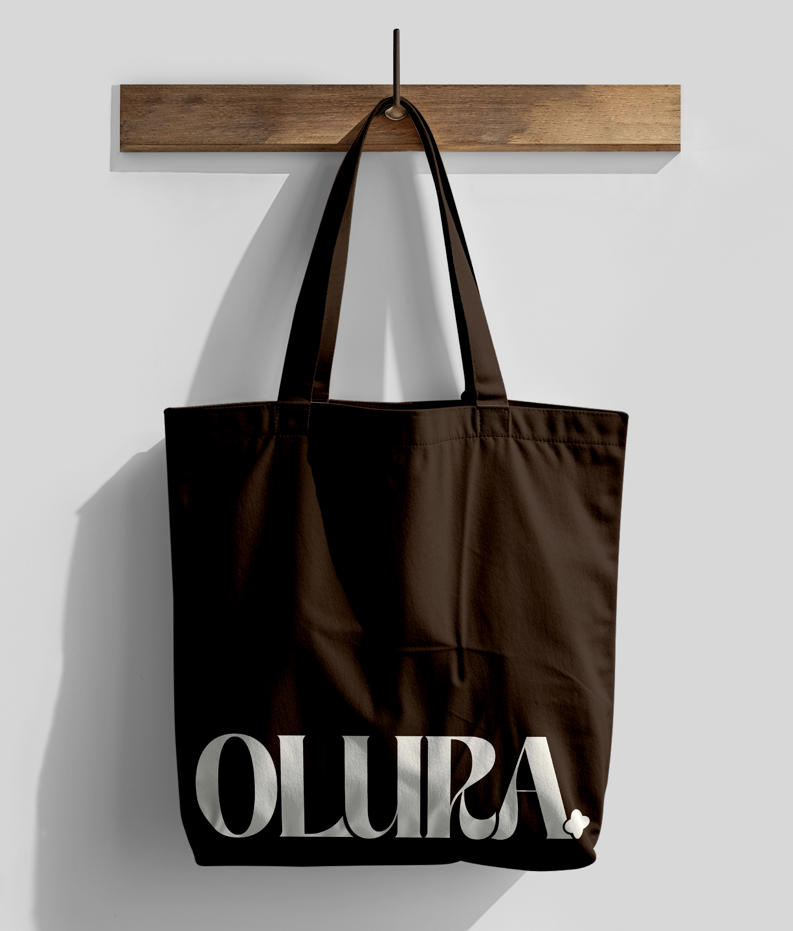
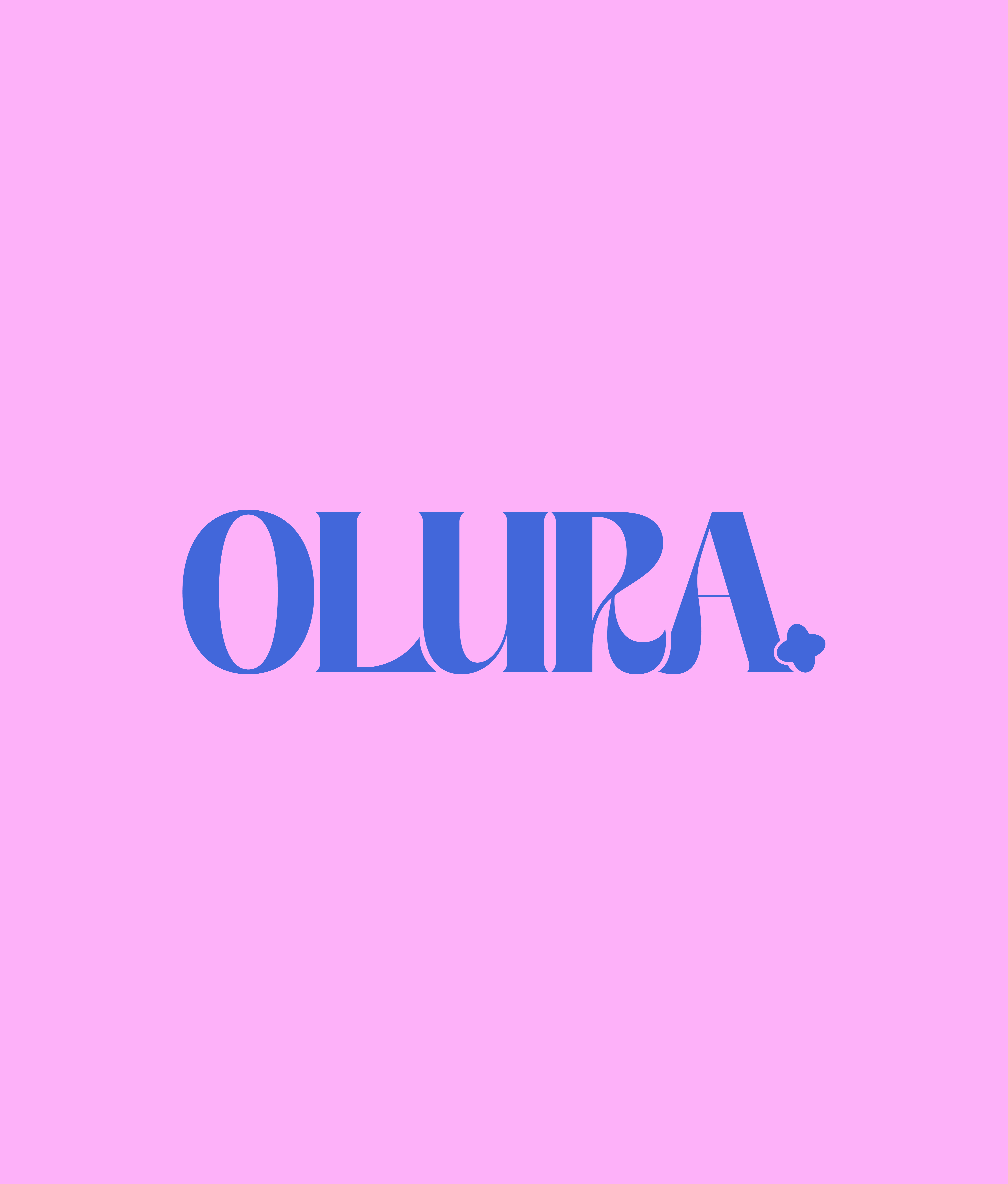
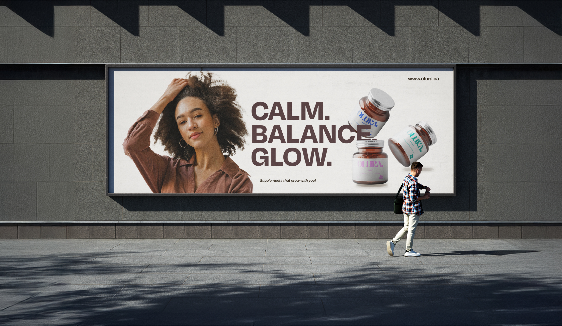
The wordmark is warm and bold feminine without being delicate, bold enough to lead on a small label without shouting. The flower mark sits beneath it on every jar, small and considered, the brand's quiet signature. Wellness that looks like something you actually want on your shelf.


Brand Strategy
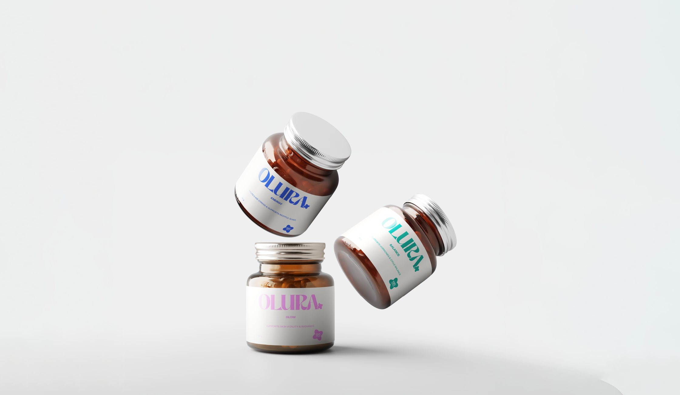
Young women don't choose between wanting something that works and wanting something that looks good on the bathroom shelf. They want both and they make the purchase decision based on both at the same time. The design had to signal efficacy and desirability simultaneously.
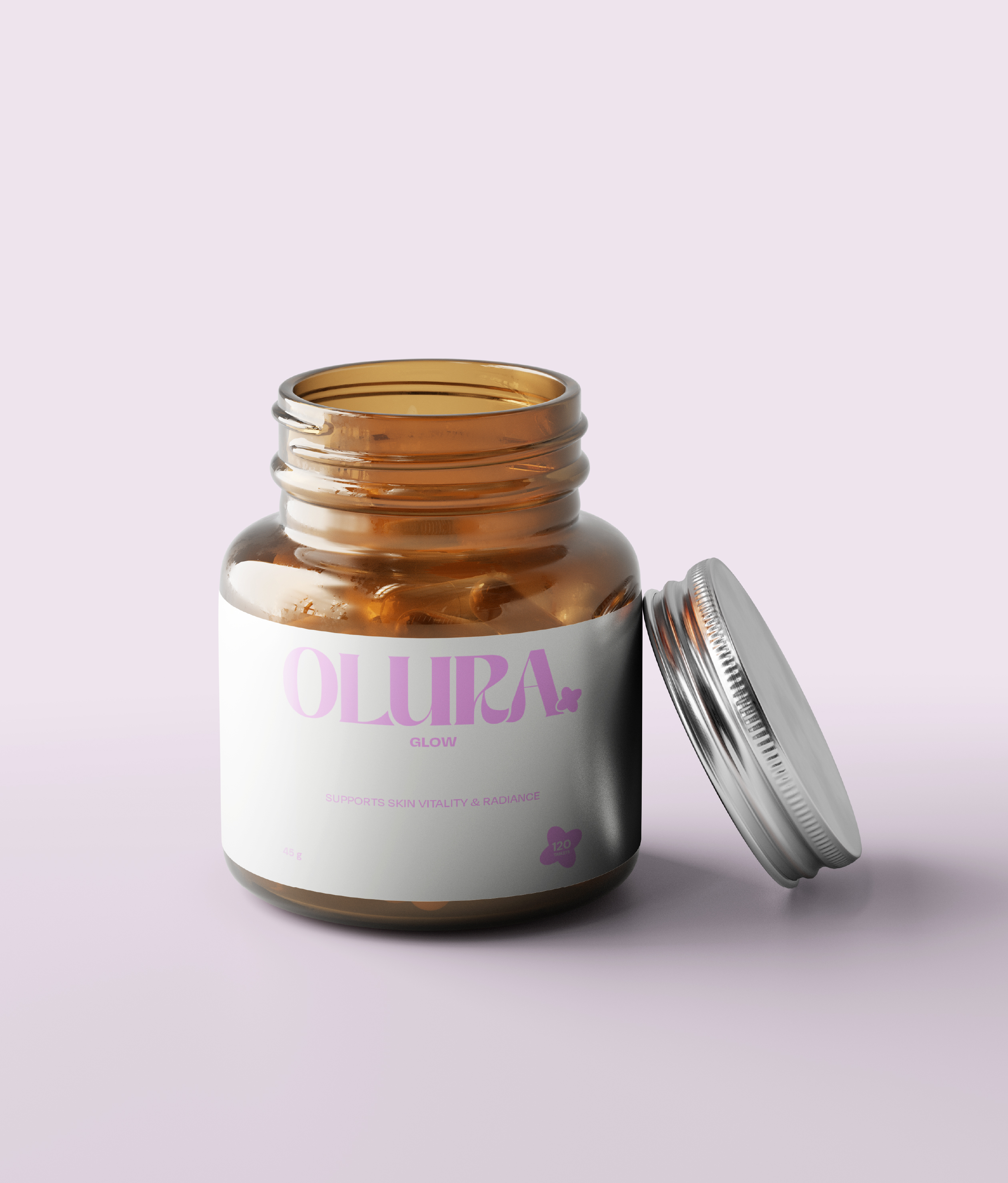
This shaped the colour strategy. Rather than applying one brand colour across all three products, each product was given its own colour identity mapped to its specific benefit. Glow in pink for skin and vitality. Energy in blue for focus and activation. Balance in teal for calm and hormonal support.
The colours were chosen for immediate emotional legibility. A consumer should understand the product category from the colour alone before reading a single word on the label. That reading happens in under a second at shelf level and the design has to work in that window.
The three colours are distinct enough to differentiate on a shelf and cohesive enough to read as a family. Any future product can be integrated by adding a new colour to the system. The architecture scales without requiring a redesign.
The Design Decisions
The wordmark is warm and rounded. Feminine without being fragile. Heavy enough to hold its own at label scale on a small jar diameter.
A small flower mark sits beneath it on every product as a brand signature. It references natural ingredients without spelling it out literally. Quiet but consistent.
The label was designed to be read in three stages. Colour registers first, product category and benefit. Wordmark registers second, brand trust. Product name registers third, specific benefit confirmation. This mirrors the actual sequence a consumer uses when scanning a supplement shelf: category, then brand, then specifics. The design follows the behaviour.
What This Project Demonstrates
Building a multi-product system means designing the architecture before designing any single product. The decision to create a shared form with variable colour identities meant the three products could be designed as a family rather than three separate labels that happen to share a wordmark.
Colour here is not aesthetic. It is functional information. Each colour answers a question the consumer is already asking before they reach for the jar. Design that answers questions before they are asked is the most efficient form of communication there is.