
I'd love to hear from you
Whether you have a project in mind, or just want to say hi.
Whether you have a project in mind, or just want to say hi.
Shoot me an email

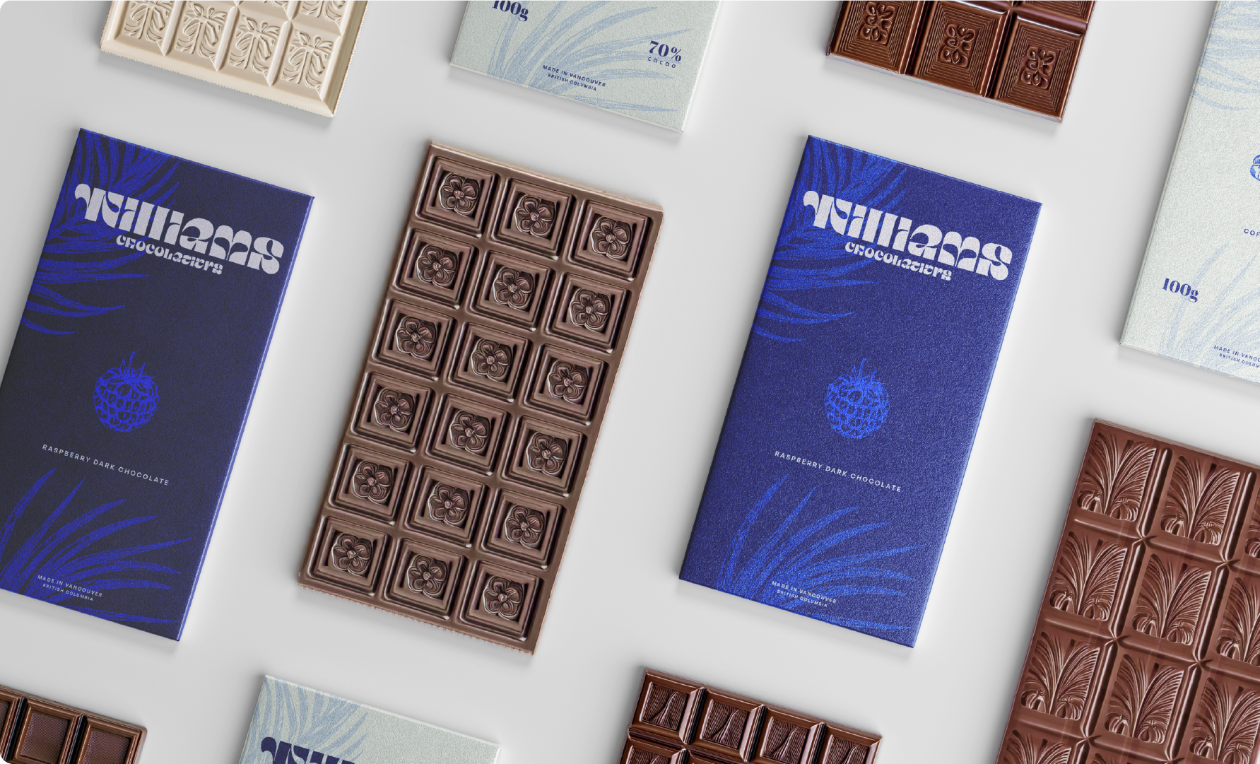
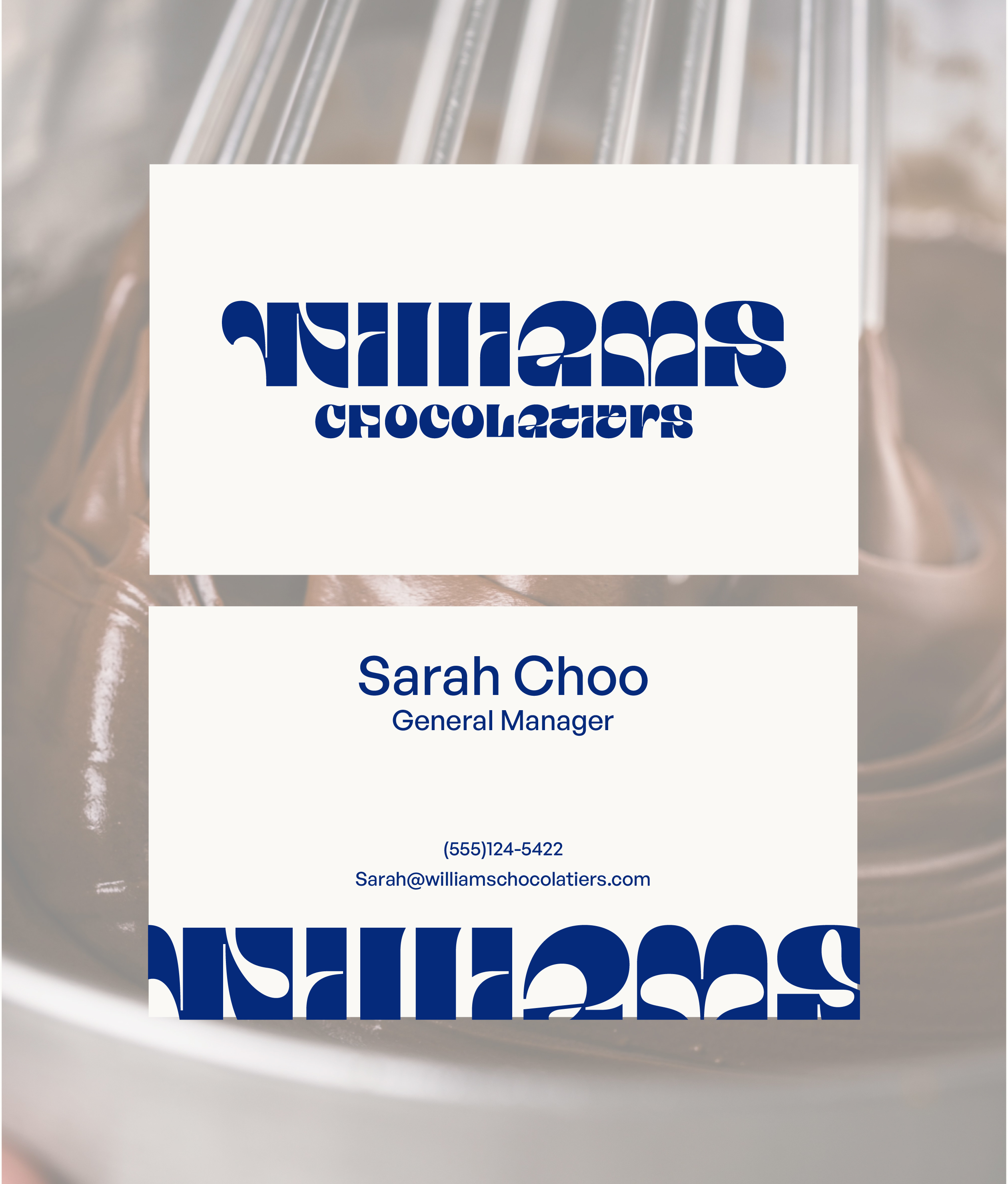
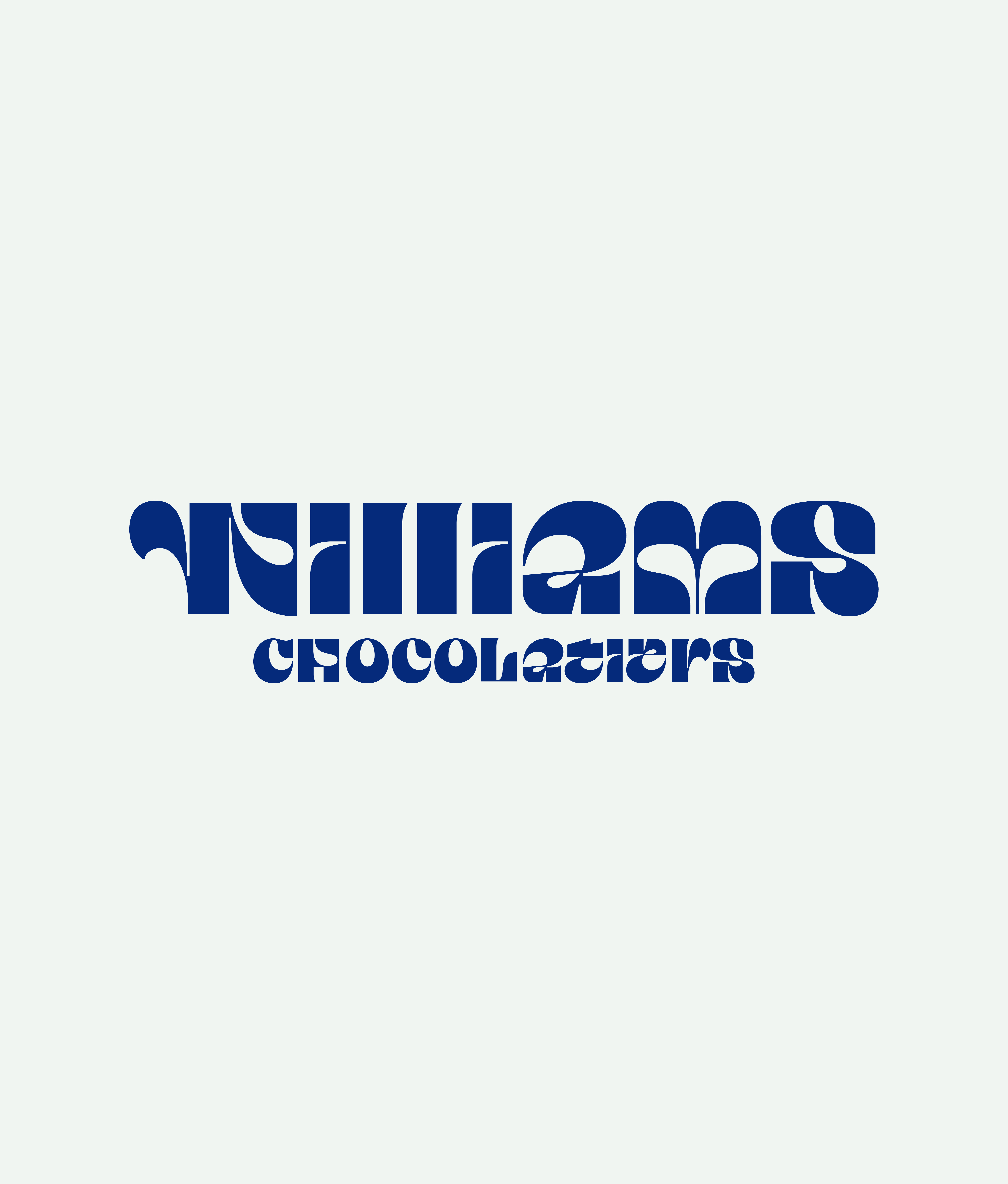
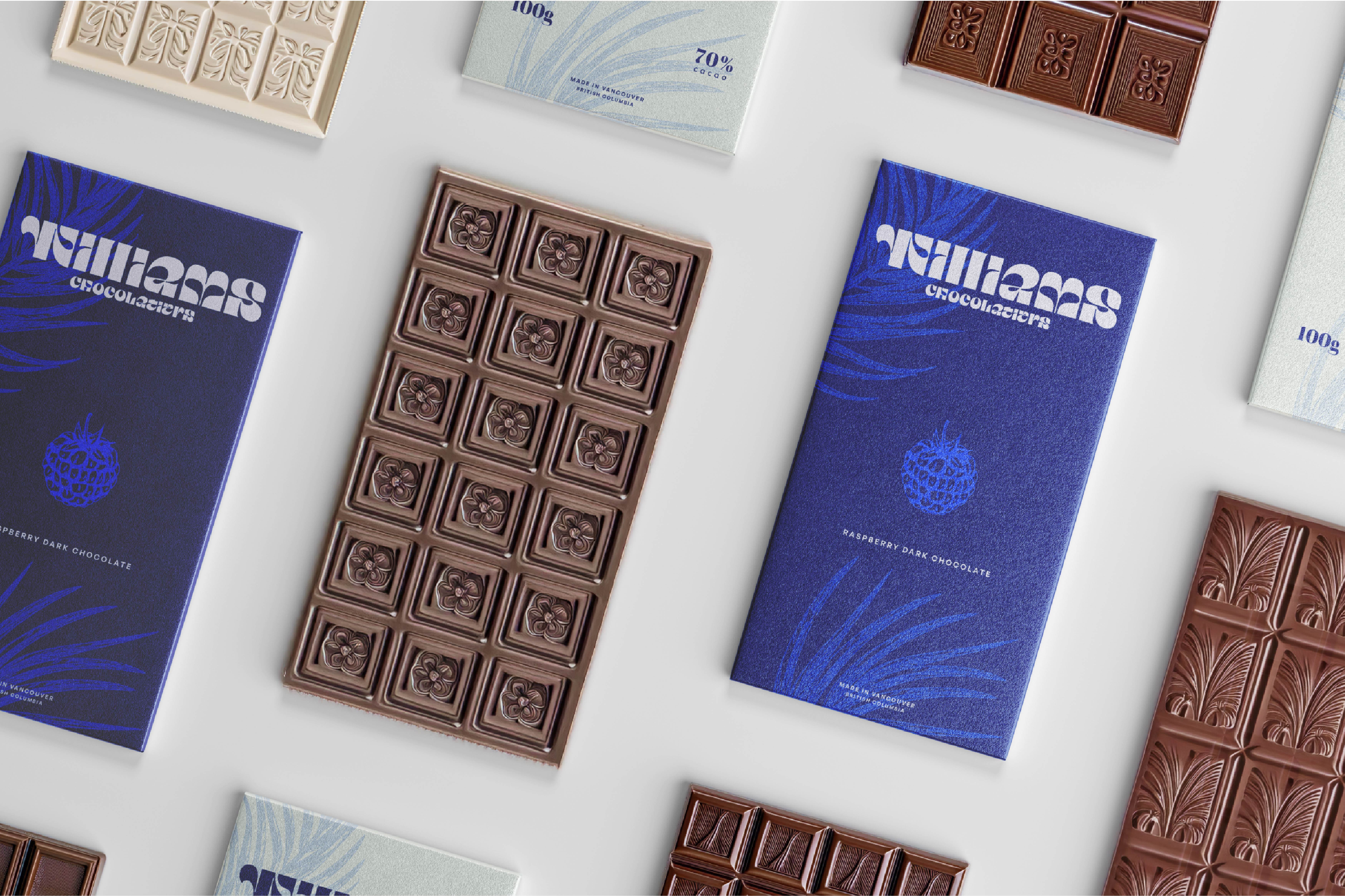
The category has spent decades saying the same thing with the same tools. Gold foil. Dark brown. Black. Restrained serif type. Every brand follows the same logic and the shelf becomes a wall of sameness. Williams refuses that language entirely. Electric blue. Botanical illustration. A bold display wordmark. Premium on its own terms.
Brand Strategy
The first step was a category audit. Every major premium chocolate brand mapped against colour, type, and visual tone. The finding was consistent: blue is completely absent from the category. Not underused. Absent.
That absence is the strategy.
When every competitor operates in the same warm, dark, gold-adjacent palette, the brand that steps into unoccupied territory doesn't just stand out. It reframes what the category can look like. The risk with electric blue was that it would read as cold or clinical. The solution was in the details: the botanical illustration style, the warmth of the display wordmark, and the natural canvas colourway all bring warmth at close range. From across the room, you notice it. In your hand, you want it.
That tension, disruptive from a distance, considered up close, is what the whole system is built around.

The Decision That Mattered Most
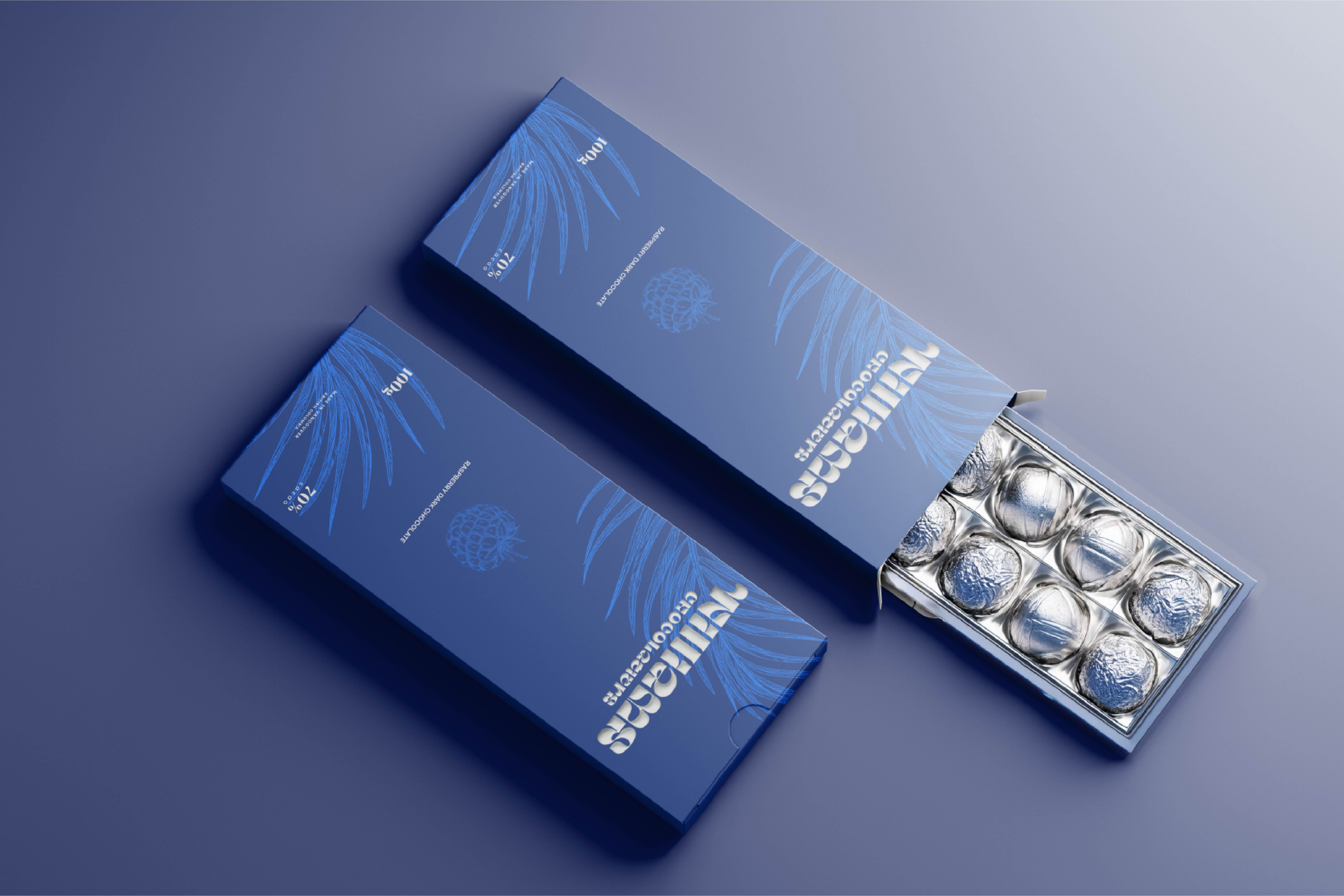
The two-colourway system was not an aesthetic choice. It was a channel decision.
Full-bleed electric blue is a campaign object. It photographs well, stands out on social, and works as a gift. Electric blue on off-white is a retail object. More breathing room, more accessible, better suited to an everyday purchase rather than a considered one.
Same brand. Same identity. Two completely different consumer contexts, without building a separate design system for each. Most packaging projects solve for one context. This one had to solve for two, and the constraint made the system stronger.
What This Project Demonstrates
Differentiation through category negation is one of the most underused moves in brand design. When a market has converged on a single visual language, the brand that refuses it doesn't just stand out. It reframes what the category can be.
The discipline it requires is the opposite of restraint. Not holding back, but full commitment. Blue works here because it is used completely. The moment it becomes an accent, it becomes a mistake. Half-measures in this kind of positioning always read as accidents.